Your work as an association staffer includes many responsibilities. From events to membership renewals, data entry and more, your to-do list is never-ending. No matter the amount of work though, one priority that should always be at the top of your list is driving conversions on your site. Conversions promote growth, increase your bottom line, and keep your association afloat.
Conversions aren’t just sales. Conversions could be an email opt-in, subscription signup, ebook download, etc. The more a user interacts with your content, the better. These mini interactions help prospects develop an understanding of your mission and hopefully a desire to learn more. Plus, nurturing a lead with content before you ask for the sale is pretty much the standard nowadays.
Kissmetrics wrote an interesting post on conversions, the mistakes you’re probably making and how to fix them. They brought up some great points on messaging and design and how small tweaks could affect your metrics. Here are some of my takeaways:
Aesthetics, functionality and member needs
The best websites are not only aesthetically pleasing but also functional. It’s essential both components are thoughtfully executed because one without the other will lead to an unsuccessful site, low conversions and a hit to your bottom line. “A cheap, outdated design with grainy stock photos isn’t going to cut it… People won’t trust it – or you – and if they don’t believe you’re trustworthy, they won’t convert,” (Kissmetrics).
If you feel stuck, start with member needs. What is driving a user to your website? Is it to purchase a membership, sign in to the portal, or download a whitepaper? Think through each specific pathway and make certain their needs drive design and function.
Cleverness or to the point?
Another component that can make or break conversion rates is your copy. First and foremost, your copy should make sense. Depending on your industry, however, there is wiggle room for creativity. The American Institute of Graphic Art (otherwise known as AIGA) is an association for designers. Their homepage features a creative grid layout with fun colors, artistic graphics, and keywords that emulate community and creativity. If you dive into other pages, you can see this kind of copy carried throughout the site.
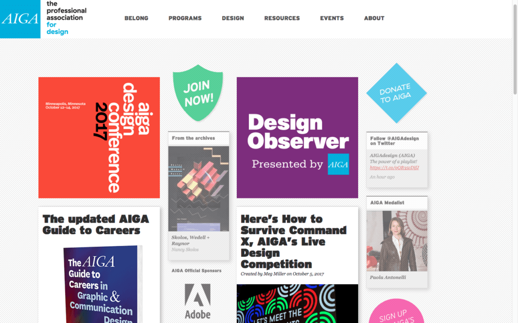
Image Credit: AIGA
Their strategy works because of their audience. In comparison, if this site was built for an association of accountants, it probably wouldn’t have the same effect.
When in doubt, test it out
After you’ve optimized your site and copy, test it out with analytics or user reviews. Because you’ve been so involved in the build-out, you may be blind to glaring issues. Ask an outsider to navigate your site. Did they understand the copy? Could they easily find what they were looking for? Use their feedback and page analytics to make changes.
Your Mobile Reach
Over half of your web traffic is coming from mobile devices. If that’s not an incentive to optimize, I don’t know what is! If you want a member to click on a CTA, download an ebook, or sign up for membership, make sure these options are easily accessible in the mobile version of your site.
If you’re a one man / woman show, redesigning your site for conversion optimization can be time-consuming and overwhelming. Let us help! Email me at aketcham@arcstone.com and I’ll content you with one of our digital strategists.