
Did you know that over half of your website’s traffic comes from mobile users? 2016 was the first year mobile access surpassed desktop traffic. And it’s likely this number will continue to increase.

Image Credit: StatCounter
Mobile Responsive Vs. Mobile Friendly – What’s the Difference?
Considering this stat, it’s more important than ever for your site to be mobile-responsive. Mobile-responsive sites are “built from the ground-up with mobile transitions and user experience in mind, and they resize and adjust proportions, images, and text according to specific devices”. Many sites are mobile-friendly, meaning they allow users to access a mobile version of your site but don’t dynamically change based on a user’s actions. See an example from Kissmetrics below.
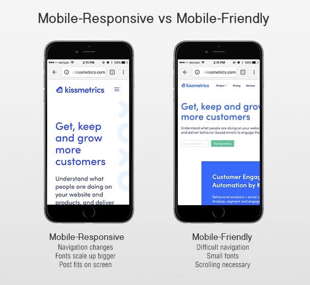
Image Credit: Kissmetrics
As you redesign your site or tweak certain components, think about a member’s mobile experience. Take out your own phone to test it out. It’s likely members navigate to your site to find a document, register for an event, or pay their dues. If your site falls in the latter image, those components aren’t readily available. They take some scrolling, minimizing and overall, way too much time. If you’re not convinced, read this stat from Google’s Think Insight about sites that aren’t mobile responsive.
“There’s a 61% chance they [a customer] will leave immediately and go to another website (most likely a competitor).”
If your association has a large pool of competitors, think hard about that percentage.
Responsive Design is Important for SEO
In 2012, Google announced that mobile-responsive websites will rank higher in SEO than mobile-template sites. Reason for their decision? It’s easier for bots to crawl a site that’s mobile responsive because those “sites… serve all devices on the same set of URLs, with each URL serving the same HTML to all devices and using just CSS to change how the page is rendered on the device,” rather than navigating the main URL and a mobile template version.
Poor Load Time for Non-Responsive Sites
Sites that are built with a mobile template take longer to load. A mobile device can’t access all desktop displays and configurations at the same speed as a desktop. And we all know what correlates with slow speed – a high bounce rate!
Check your mobile site’s speed with this tool from Google.
Check Mobile Traffic with Google Analytics
If you’ve read this far, you might be curious about your own mobile traffic. If you have Google Analytics installed, there’s a tab to check out info on mobile users. Just go to Audience –> Mobile.

GA can break it down by device, length of session, and bounce rate.
What do I do?
Now that we’ve convinced you your site needs to be mobile-responsive, what can you do about it? Ideally, you’d build your site that’s coded for responsiveness. But if that’s out of your budget or not approved by stakeholders, Kissmetrics offers a few tips you can implement for free or a small cost.
- Design – Walk through the mobile experience on your own phone. What small elements could you change about design that would make the UX better? Think CTA’s, information above the fold, the navigation, etc.
- Mobile-friendly – Check to see how mobile-friendly (not to be confused with mobile responsive) your site is using this Google test. The results give you a good baseline and could help convince your board a redesign is necessary.
- Conversion Roadblocks – If nothing else, see where your visitors are having problems converting. Set up tests. Analyze the results and try again.
Optimizing your site can be a lot of work – let us help! AMO’s parent company, ArcStone, is a robust web design agency that would be happy to help build and optimize your website.